

On this page ▾
Layouts
Set a layout in a slide's frontmatter with layout: <name>. The names and props match Slidev. The first slide is cover and all others are default unless you say otherwise.
| Layout | Use | Props |
|---|---|---|
default |
Normal content. | |
cover |
Title slide. | background: a colour or an image, dimmed. |
intro |
Introduce the talk. | |
center |
Content in the middle of the screen. Add class: text-center to centre the text too. |
|
section |
Start of a new section. | |
statement |
A statement as the main content. | |
fact |
One big fact or number. | |
quote |
A quotation. | |
end |
Last slide. Shows END when empty. |
|
full |
Content uses the whole screen, no padding. | |
none |
No styling at all. | |
image |
An image as the whole slide. | image, backgroundSize |
image-left, image-right |
Image on one side, content on the other. | image, backgroundSize, class (goes to the content) |
iframe |
A web page as the whole slide. | url, scale |
iframe-left, iframe-right |
A web page on one side. | url, scale, class (goes to the content) |
two-cols |
Two columns. Slots ::left:: (also the default text) and ::right::. |
class (both columns), layoutClass (the whole layout) |
two-cols-header |
A header, two columns and a bottom row. Slots ::left::, ::right::, ::bottom::. The text before the first marker is the header. |
class, layoutClass |
404, error |
Shown when an address matches no slide, or a slide fails. |
image is an address (/photo.png is served from the public/ folder) or a colour for the background. backgroundSize defaults to cover.
An unknown layout name prints a warning that lists the names and uses default. Themes and decks can add layouts or replace these, see Themes and addons.
Pictures
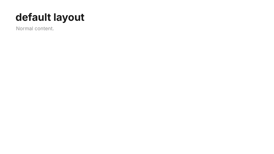
default
cover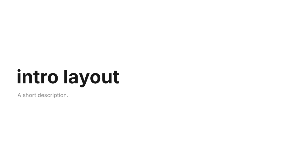
intro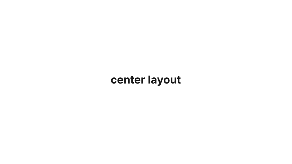
center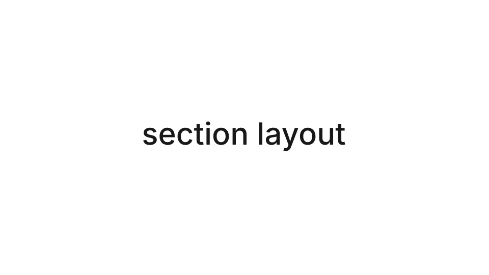
section
statement
fact
quote
end
full
none
image
image-left
image-right
iframe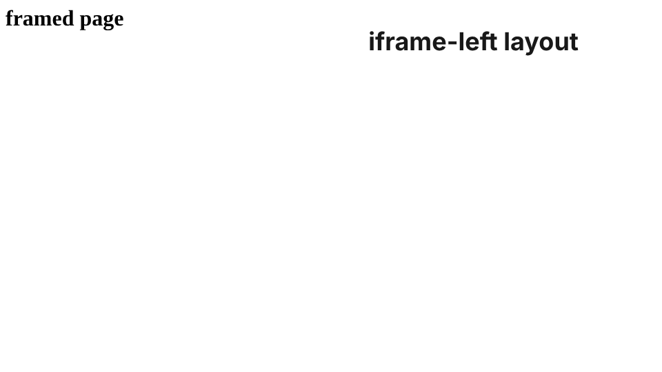
iframe-left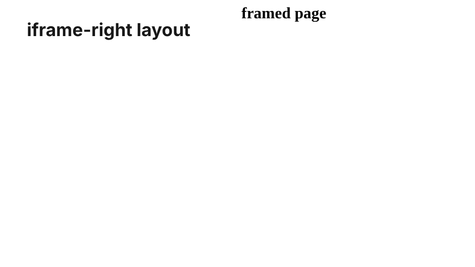
iframe-right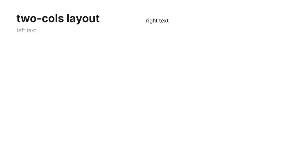
two-cols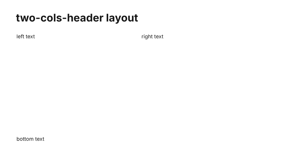
two-cols-headerThe pictures are slides of the built-in theme, taken from slide.ng's own test decks.